This page is a compilation of projects I have worked on in different advertising or marketing classes
“Words have Feelings”
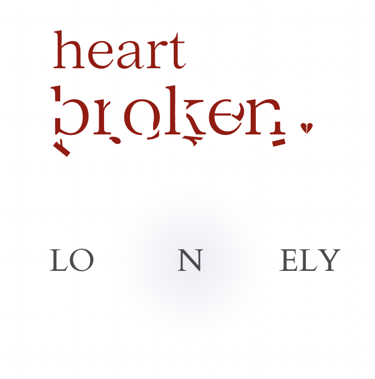
For this assignment, we were assigned to express the emotion that of that word using only that word.
In the word “Heartbroken”, there are bits and pieces of the word broken that have broken off and fallen to the invisible ground. I chose this because in a heartbreak from a romantic love, it can often be a slow deterioration or pain caused over an extended period of time before there is a breakup.
In the word “Lonely”, the word is in a desaturated blue almost to the point of being grey, the N is separated on both sides from the rest of the word surrounded by a darker shadow. I wanted to isolate the N rather than the L or the Y because I wanted it to show even when you are a part of a group/team or surrounded by people, you can feel isolated and lonely.
“Final Consulting Project”
Branding Prompt: Flower Planters (Service that makes your yard have color year round. Seasonally replaces the flowers in your beds. Pay by season or annually)
this is the logo I designed for this project, I love creating logos and though this one was simple and would resonate well with our target audience of Gen Y. I wanted it to be minimalist, and comparable to something like Hearth and Hand with Magnolia in the target demographic.
“Display Ad Design”
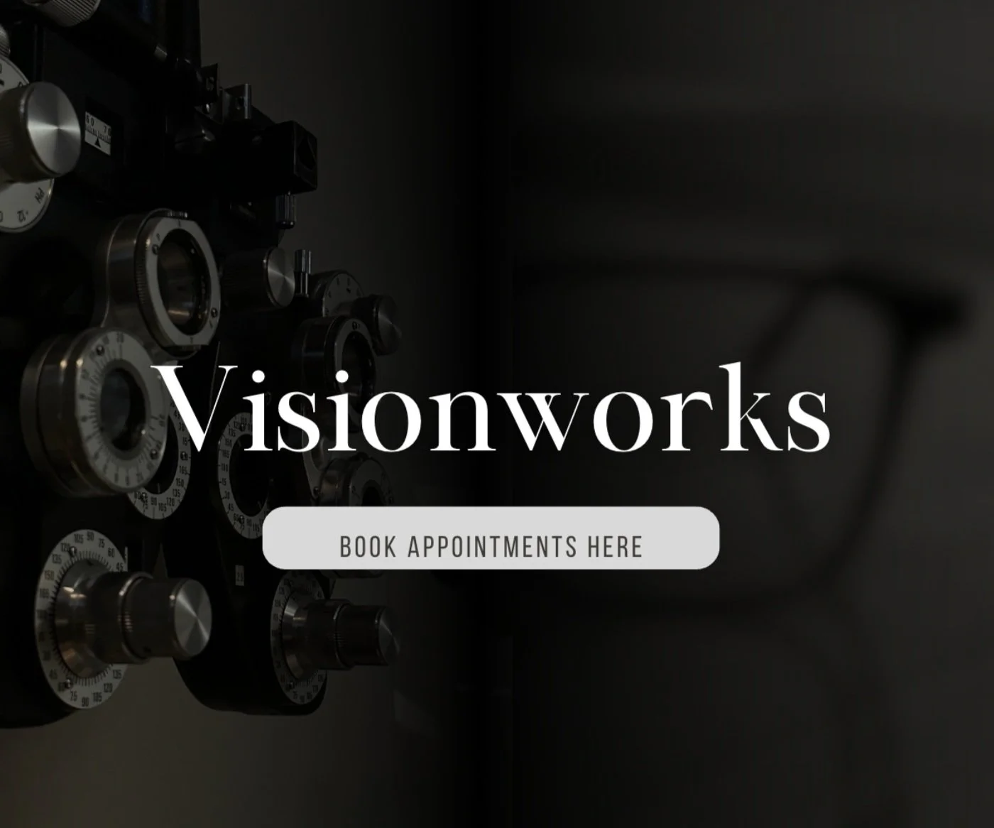
For this assignment we had to create display ads in various sizes, I chose to create one for Visionworks. I used two photos I took, One while I was at the Optometrist, the other while in class.
I received good feedback for the design though it is quite simple.
I chose to keep the glasses out of focus on the half that said “works” and the side with the Phoropter in focus with the word “vision”. I liked the dark atmosphere when I was actually in the eye doctor’s room for my appointment and wanted to reflect how that feels in the design.


